In the industry of Industrial Automation – our graphics tend to be highly specialized. That, combined with the fact that not everyone is a graphics or digital designer leads us to a few shortcuts in conveying information within our industrial displays.
One such shortcut is using color fills in vector graphics to convey states. Some common states may include stopped, in an error state, in use, or otherwise needs the operators attention. With these operational states in mind, and this motor, how might an HMI designer address these things via the visual interface design?
Creating the Motor Graphic
To get started, we’ll pull an industrial tank graphic from our graphics library. Specifically, we’re using the ‘Colloid Mill 2’ graphic, from the food and beverage HMIcons vector pack.
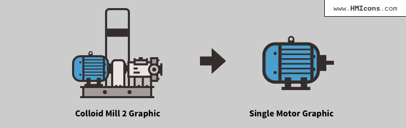
We don’t need all of this vector art for the example, so we’ll pull out just the motor portion from the vector image. Easy! The HMIcons vector library is really flexible in this way. Bits and pieces of the industrial images can be swapped, changed and moved in any way you see fit for your application.
Using a Color Fill to Indicate State
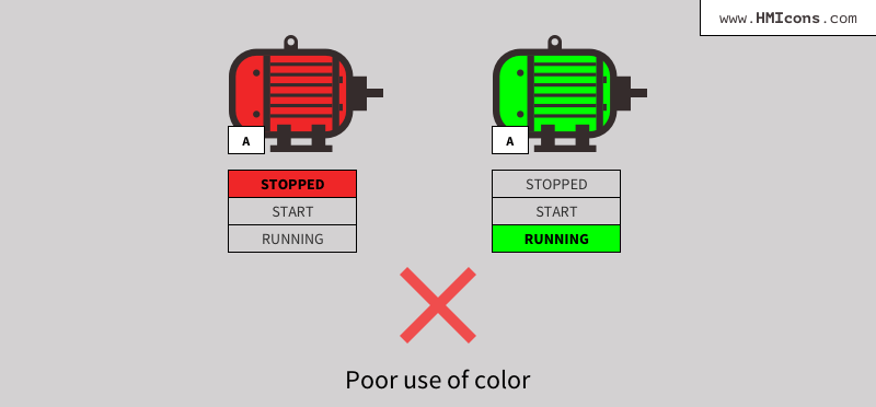
Here’s how these graphics are typically colorized in industrial SCADA interfaces. You might see red for STOPPED and green for ON, or RUNNING. The problem with this use of color is that it’s distracting and visually overpowering, especially when in the context of a large, data-dense industrial application. We want to reserve the use of color for alarm states or otherwise attention grabbing needs whenever possible.
A better way to use color fills to indicate states in our interface would be to adhere a bit more closely to the high performance HMI design guidelines. A gray color fill within the stopped motor minimizes the visual attention drawn to a stopped motor. The dark color pushed it to the visual background for the operator. When the motor is running, we use a lighter, nearly white color fill to indicate this. Combined with the words STOPPED and RUNNING, we have a better use of color fills for our industrial graphics.

Recognizing Alarm States
Additionally, this limited use of color in our graphic fills aids in alarming recognition. When we’re using a more restricted color palette, the alarm states become much more important and able to draw our operators attention, when present.
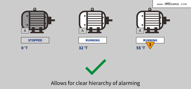
You’ll notice the alarm here is double encoded using shape and color to indicate its urgency. The inverted orange triangle helps to ensure the meaning of the alarm state is readily known at-a-glance.
Was this article helpful? Consider purchasing the HMIcons Master Collection. It’s a sophisticated graphics library, purpose-built for industrial applications. With SVG vector industrial graphics of specific machinery and tools commonly found on factory floors, this illustration set will help you to design any interface, report, presentation or dashboard in the industrial automation industry. Level up your designs!
Alex
Excellent article. I certainly appreciate this site.
Stick with it!
Memphis
Highly energetic blog, I loved that a lot.
Will there be a part 2?
Rachel
When creating the drawing board and subsequent HMI design, ask yourself what is important to the operator. More data does not always lead to better results, so don’t overwhelm the operator. Instead, focus on the tasks of the operator and what is needed to understand the state of the machine or process. You don’t need to display every analog value, but display the information in a way that makes the device status clear at a glance.
OKmarts.com Online Store
Nice, I think I have learnt a lot of information.